on Usability topics and techniques.
We invite you to subscribe
to our monthly e-newsletter.
Upcoming
workshops
| March 23, 2006 | Designing usable Web-based applications – One day Workshop Save $100 if you act now – early registration deadline extended to March 17. |
| May 11, 2006 | Usability challenges of new Web technologies – Neo Insight Workshop |
Upcoming
events
| March 23, 2006 | CapCHI talk “Elephant in the Living Room“, by Kevin Grignon, IBM Canada, about the culture of user experience design and organizational needs. |
| April 22-27, 2006 | CHI 2006, Montreal Quebec – Annual conference of the Special Interest Group on Computer-Human Interaction |
Web 2.0 has made the big time – Google offers twenty
one million pages about it, Yahoo has a new interface for it, CIO magazine is talking
about it, and O’Reilly has a “Web
2.0 conference” for it. Wikipedia
describes Web 2.0 as referring to the “second phase of architecture
and application development for the World Wide Web”. But how do
we make it usable? 
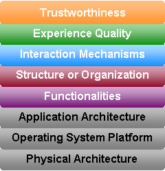
Here is one model that seems to help people – a layered view of the
user interface. Lots of our clients work on the software underneath
the user interface. But more and more code is in the user interface.
We find that breaking the user interface into multiple layers helps
us discriminate what is otherwise a tangle of design issues between
the underlying functions provided by the application, the way information
is presented to the user, and the mechanisms in place which permit the
user to interact with the application. We describe these layers (working
upward) as: functionalities, structure or organization, interaction
mechanisms, experience quality, and trustworthiness.
These layers help us focus precisely on what users value and areas
that could be improved. The layered view also makes way for ideas
and insights that may cross layers. For instance, a hyperlink is
an “interaction mechanism”,
but it can be presented many ways. Providing a better sense of where
a hyperlink will lead helps users stay focused on a task and gives
them more confidence to explore an improved “experience quality”.
Designing hyperlinks in the context of Web 2.0 means that we can
entertain more options for augmenting the information provided about
a link before the user clicks on it, or even create hyperlinks on-the-fly.
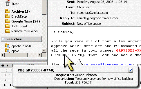
Zimbra
applies Web 2.0 techniques to dynamically associate database information
with certain patterns it recognizes in emails or other information
systems. For example, it may recognize purchase order numbers in
the context of an email and provide additional information (extracted
from the database in real-time) when the user rolls their mouse
over each number in the email (see sample screen shot). It can also
be used to link phone numbers to address book information, dates
to calendar entries, parcel tracking numbers with status information,
etc.
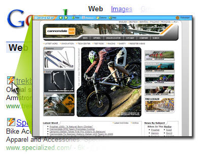
Browster’s instant
view is another example of linking “interaction mechanisms”
(rolling a mouse over images on the screen) with an underlying “functionality”
layer (seeing a preview of the page with active links). This permits
rapid viewing of search page results without having to click blindly
on each result and then click the Back button to explore other results.
This saves time and improves the “experience quality”
layer discussed earlier.

These new functionalities are made possible by
application programming interfaces (APIs) provided by vendors such as
Google, Yahoo, and others. You may have seen some examples of overlaying
real estate properties on Google maps, or using the maps to link to
local restaurants, banks, etc.
Web 2.0 provides the opportunity to enrich the
user experience. The challenge is trying to understand how these new
capabilities can best be deployed. Our workshop on Usability
challenges of new Web technologies examines these new trends, opportunities,
and potential pit-falls in more depth.


