In this issue
- Win the war on distraction
- Improving Find People, the #1 intranet task: Webinar recording now available
- Biggest challenge in user experience
Win the war on distraction
Distraction is a major source of usability issues we see across many usability testing projects. Distraction stops your web visitors in their tracks. Ironically distractions often occur because a website is trying to do too much: too many options, links, text, or images. When the user is barraged with dozens of helpful links or buttons they respond to it as they would to too many helpful people making suggestions all at once.
Information overload distracts users from their task. This is bad news for you. Most people who visit your website are there to do something. If they get distracted they can lose focus, or leave. Distractions have a direct impact on web task performance, on your level of customer service, and on your bottom line.
The cost of distraction can be huge. In usability testing, we see lots of time wasted by distractions when people take too long on their task, or give up. Gloria Mark at University of California at Irvine says that workers change tasks every three minutes, and, once distracted, take nearly a half-hour to resume the original task.
The good news is you can win the war on distraction. Prioritizing your web resources to serve top tasks can help. Often that means getting rid of distracting links, buttons, or menu items, and de-cluttering. If you can solve your distraction problems, your website can become the important tool you hope it can be, by helping people stay focused on their task. Your intranet, equally, can become an important work tool, helping workers get work done. The way to win is to eliminate distractions from navigational menus and links, in search, and anyplace on your site that is critical to completing top tasks.
Here are some ways to win the war on distraction, along with links to articles for more details:
Too many steps or clicks invite distraction
People get distracted when they have to navigate through lots of pages just to complete a task. The more pages users have to visit to get their task done, the more likely they are to be distracted. The longer a task takes, the more likely a person is to lose focus, be interrupted, etc. If a user is unclear about which link will complete their task, they are more likely to look around and get distracted. For example, registering for a new business number on Canada Revenue Agency (CRA) takes 7-10 steps from the CRA main page, just to begin entering data into fields. Business owners have to do this task a couple hundred thousand times per year. No wonder 18% of phone calls to CRA are about Business Number Registration, and most of those by third party intermediaries who profit by explaining it to business owners. Too many steps invite distraction, and add a burden to already-busy people.
Here are some ways to fight distraction invited by too many steps or clicks:
- De-clutter the paths to top tasks. Top task paths are like arterial highways. Get people on their way. Don’t slow them down with lots of choices.
- Read our article: Your user is in “get there” mode
- Help people move forward. Contextualize navigational links and menus as they click.
- Read our article: Contextual navigation helps people stay focused on their tasks
- Make sure visitors can accomplish most tasks in two minutes or less. Ensuring excellent task performance prevents all kinds of problems.
- Read our article: Make web tasks faster
Links that are not easy to see cause distraction
Visitors to your website are on-task. Anything that causes them a delay is a distraction. Providing an over-abundance of links takes people time to scan, and may cause people to scan even faster, missing the very link they came looking for. Links can be hard to notice if they are in long lists, not descriptive, not meaningfully categorized, or embedded in paragraphs. Sometimes they are downright invisible. This results in web visitors clicking any links that are even remotely related to their task.
Placement of links can result in a different kind of distraction. A link that is away from the primary scanning area, or off to the right can take a long time for people to notice. If a link looks like an ad people will avoid it.
Here are some ways to fight distraction caused by links that are not easy to see:
- Put links that support top tasks in visible places.
- Read our article: Link visibility and usability guidelines
- Don’t make users scan around the page for links related to a top task.
- Read our article: Bring your Top Tasks to the top
- Allow people to scan links quickly e.g. in primary scanning area, in bulleted lists.
- Read our article: Give top tasks centre stage – avoid right-side, left-side blindness
- Don’t use graphics for links to top tasks.
- Read our article: Situation critical! Where are the links?
Links that are too similar cause distraction
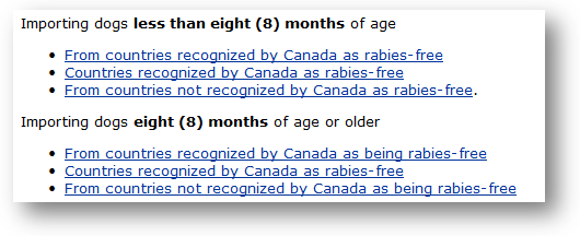
Links that contain repetitive text are not easy to differentiate from one another, and make it difficult for people to scan for unique words. This can result from page titles that are too similar to others. When link text is not uniquely descriptive about what the user can do, users continue scanning. If most links are similarly non-descriptive, the user will wonder what to do, may go back a page, or may abort their task. Here is an example of link with too much repetitive text for users to scan and differentiate quickly:

Here are some ways to fight distraction caused by links that are too similar:
- Analyse search terms for each top task, optimize landing pages to make sure links use the words people are scanning for, and monitor top tasks to improve search performance.
- Read our article: Search performance indicator
- Eliminate any link-text or menu items that are unrelated to the top tasks for that landing page.
- Read our article: Make your lists easier to scan
- Make sure top tasks can begin on the landing page without guessing.
- Read our article: Design landing pages to focus attention
Links that don’t keep their promise cause distraction
A link works well if it creates a consistent expectation for all users and then fulfills that promise. When a link creates false or ambiguous expectations, users are disappointed. When people arrive at a page with a title or heading that is unrelated to the link they just clicked, it makes them stop and wonder if they got to the wrong place. They may step back to make sure. When people click a button to “Register Now“, they are disappointed if they have to click through several more pages before they can begin registering. Canada Revenue Agency does with their Business Registration process. Or, like many university websites do with “Apply Now” links.
Here are some ways to fight distraction caused by links that don’t make good promises:
- Work on the wording of links to match user expectations as they do top tasks.
- Read our article: Good links are promises and paths – or they are pests
- If you offer links to refine a search, eliminate any that are unrelated to the search terms.
- Read our article: The Top 4 trends in search usability
Marketing and promotion links can cause distraction
Promotional links to special deals, or promoting something that is not related to the task can take users off the page they want to be on. These links could include social media, an advert for a featured whitepaper, or links to similarly-tagged content. These are distracting because they’re in the wrong place at the wrong time. Provide these offers once the visitor has completed their task. When the user is on-task, it’s time to give attention. Wait until they’re done with their task to ask for attention and show marketing links.
Graphical ads can increase the time it takes for pages to load. For example, one internet provider placed graphical ads on its website suggesting that customers upgrade to high-speed internet. The graphics added 18 seconds to the time it took non-high-speed users to load a key landing page. Users get distracted when pages take that long to load.
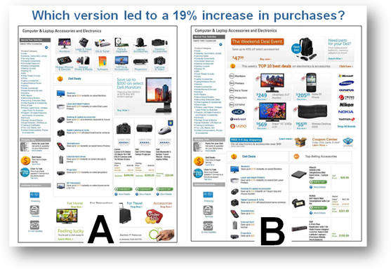
Distraction on an e-commerce site impacts the bottom line. A Dell side-by-side test of the pages below showed that deals distracted from sales by 19%. In the A/B test, version B had links to The Weekend Deal Event and Top 10 best deals at the top of the page. Version A had product-category navigation at the top instead, and garnered 19% more revenue. In other words, visitors were on these pages to buy something – they had a product in mind. The chance was small that the special deals matched their task. Thus the special deals were sufficiently distracting that they actually lost sales! When promotions are not related to a buying task, the cost of distraction is measured in sales.

Here are some ways to fight distraction caused by marketing and promotional links:
- Gather hard data, not opinion, to defend key landing pages and paths for support of top tasks.
- Read our article: Task-Based Website Management
- Read our article: Are you following best-practices guidelines for navigation?
- If you must show ads, only show ads related to the task.
- Read our article: “It must be an advert: quick, ignore it!”
In sum: Measure and manage top tasks to avoid distracting your web visitors
The root cause of all the above is not managing top tasks. Measuring task performance is a good way to manage tasks. But even in large web teams, there is often no single person responsible for the performance of top tasks. Individuals are accountable for budgets, projects, software or hardware, etc. But the performance of users on top tasks is not typically assigned to an individual. The result is that tasks are not managed. On the other hand, when people are given the responsibility for task performance, they are motivated to fix things that distract users from completing top tasks.
That’s because Top Task Management helps people measure task performance, so they can manage better. Here are a few steps you can take:
- Expert usability evaluation
A good, cost effective place to start. It will help you identify burning usability issues and will give you high-impact recommendations. Take advantage of our years of experience and ongoing expertise and insights gathered from hands-on observation and testing of users. This kind of activity can prepare you for the following activities. - Usability testing
It will help you improve task performance. Plan for it not just during a major redesign, but as a way of doing business. Usability testing will let you see where distractions are affecting your task completion rate.
- Task Identification
It will quantify your visitors’ top tasks, and prioritize the words that are important to your web visitors. - Task Performance Indicator
It tests your top tasks with real users in quantitative usability testing. It gives you benchmark task completion rates and time on task that you can use in day-to-day management of top tasks. Based on the results, iteratively and continuously improve your user experience.
Any of those steps will help you win the war on distraction. Contact us at 613-271-3001 or email us for the right approach to minimize distractions on your website.
One big way we can win the war on distraction is to help people get off the website and get to the right person. Many tasks are completed off the website. The better we connect web visitors to the right employee or service function the better for completing tasks. The biggest source of distraction at work is getting to the wrong person. Gloria Mark identifies that the biggest interruptions at work are about people finding people: a colleague stopping by, new e-mail, a phone call, or being called away from the desk. That is why our task research consistently identifies finding people as a top task on websites and intranets.
Your website can reduce distractions by supporting the top task of finding the right person. When your website improves the find-ability of contact information, and improve the efficiency of getting to the right person, your website can avoid time wasted in asking a bunch of people before getting to the right one.
For most employees finding people is the number one reason they visit an intranet. It’s the foundation for collaboration, knowledge management and the social Intranet.
Brian Lamb from Customer Carewords analyzed research on finding people tasks on intranets. The webinar was based on survey responses from over 15,000 Intranet users and nearly 200 task test sessions. Here are links to the video and slides:
- View the webinar “Improving Find People, the #1 intranet task” (WMV: 43 MB: 53 minutes)
- Download slides to the webinar “Improving Find People, the #1 intranet task” (PPT: 7 MB)
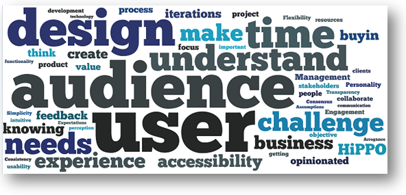
We analyzed the most-frequent challenges mentioned in a discussion in the “User Experience” group on Linked In. The discussion started with this question: “Can you use ONE WORD to describe the biggest challenge in UX?”. To date, 537 replies have been received, and the discussion continues. The word cloud below shows the most frequently used words in people’s resposes. We removed extraneous comments. We have challenging jobs!

- Distracted Workers Costing Companies Millions: (e-mail, social media, txt msg, IM, interruptions) http://bit.ly/lulqaA
- Internet Explorer Add-ons Gallery: triumph of cool over usefulness http://www.iegallery.com/us/addons/default.aspx
- How much does your website cost? Getting to Govt ROI @dianarailton:
- First Things First: Fix the Tasks! Mike Atyeo presentation (27 slides)
http://slidesha.re/lZ9VIn - Hands-On Task Management: From Interaction Design to Web Strategy: #jboye tutorial slides + attendee stickies!
http://slidesha.re/j00woo
Quote of the month
“Just get rid of the crappy stuff and focus on the good stuff”.
Steve Jobs


