Neo Insight’s e-newsletter on Customer Experience topics and techniques.
The use of mega menus is increasing ever since Jakob Nielsen’s 2009 article: Mega Drop-Down Navigation Menus Work Well. Mega menus refer to large panels of links that drop down or fly out when the user hovers over global navigation elements. They can provide users with rapid access to the most frequent and critical tasks from anywhere in the website. Unfortunately, we estimate that 90% of mega menus are not realizing their full potential due to poor design and implementation. They often provide poor support for users’ top tasks and an unnatural style of interaction. The good news is that getting them right is not that difficult.
90% of mega menus are poorly designed and implemented but getting them right is not that difficult – focus on the user’s top tasks and fine tune the timing of the interactions
Mega menus can lead to mega success, but only if you attend to the details. A recent project of ours found that a newly designed mega menu could handle 70-95% of all support related tasks on this client’s website. That is quite an accomplishment, but it doesn’t happen by chance. There are two key attributes that make for a successful mega menu.
1. Right links: Link labelling, layout and organization
2. Right interaction: Timing, feedback and support for natural movement
Right links: Link labelling, layout and organization
Mega menus are like small, concise HTML landing pages. They are designed to provide an overview of the sub-sections within one major section of a website. They provide signposts to frequently accessed or critical content and should support the top tasks for that section.
Some of the best practices for layout, organization and link labelling are:
- Ensure all labelled links are to top task content or functionality
- Provide escape links to other, “tiny task” content
- Make the menu easy and fast to scan
- Keep the layout simple, with no more than 3 to 5 columns
- Group or organize links into meaningful categories
- Use typography to clearly differentiate category titles from the sub-links
- Use white space to help group related content
- Use CSS to style the menu
- Use textual links rather than images
- Each category should have no more than 5 2 links as exemplars of that category
- Exemplars serve two purposes: they help to define the category by example and provide direct access to the top tasks within each category
- Ideally both parent and child elements are linked
- Keep link labels simple, intuitive and unambiguous
- Avoid long, concatenated labels (e.g. Business cards, stationery & envelopes)
- Put discriminating words first (people only scan the first word or two)
- Avoid wrapping of link labels
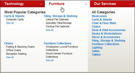
The following example from Office Depot demonstrates a number of best practices, including:
- Mega menu is clearly linked to its associated global navigation element (Furniture)
- Top tasks are supported in category title links and sub-links
- Categories of top tasks are grouped logically and visually
- Category titles are linked to a landing page to access additional content and tasks
- Top level navigation elements use down arrow icons to indicate the presence of mega menus

By contrast, the following example has too many columns, no grouping, no category labels, no logical ordering of items and a tool tip that obscures the first link.

Right interaction: Timing, feedback and support for natural movement
Ignoring the timing of menu opening and closing is by far the most common reason for mega menu failure. People are often confronted by mega menus when they don’t need them. Just moving their cursor may produce a barrage of unwanted flashing menu panels. Or, when they do try to access the mega menu it often disappears prematurely. People lose their sense of control.
Many times we’ve observed the following frustrating experiences. Any of them sound familiar?
- You try to move your cursor from the top of the page to a link just below the global navigation bar but in passing over the global navigation a mega menu pops up covering the very link you are trying to reach.
- You open a mega menu and see the link you want near the bottom or far right of the panel but in trying to move your cursor to click on it you overshoot a bit, run off the edge of the panel, and the menu disappears.
- You try to move directly from the tab that triggered the mega menu to a link, but in so doing you cross over a neighbouring tab en route and accidentally trigger a completely different mega menu, replacing the one you are trying to navigate.
Some of the best practices for mega menu timing, feedback and natural movement are:
- Indicate the presence of a mega menu with a down arrow icon
- Do not trigger a mega menu unless the user has slowed her cursor movement (e.g. less than 10 pixels per second) and paused for 300-600 milliseconds
- Display the mega menu in its entirety in less than 100 milliseconds
- Preload mega menus in the background to ensure a rapid display when triggered
- Highlight the global navigation element associated with the current mega menu
- Ensure the clickable target areas are large enough – link the entire menu element, not just the text
- Remove tooltips from the main triggers so they don’t block menu items
- Do not remove the mega menu unless the cursor leaves the menu for 400-600 milliseconds
- Ensure the mega menu closes within 100 milliseconds
- Delay closing a menu by 400-600 milliseconds to make sure people can get to their desired sub-link, even if they momentarily transition over a neighbouring mega menu trigger area
The need for the last item in the list is due to the fact that most people try to take the shortest path to the link their desired link. Unfortunately many mega menus do not allow for this type of intuitive behaviour. Moving the cursor diagonally often unexpectedly triggers neighbouring menus and people have to start all over again.
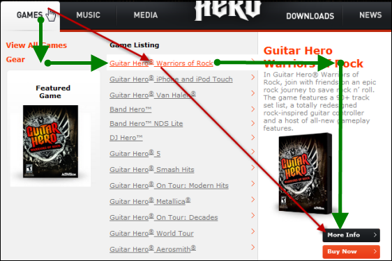
The Guitar Hero site is a good example of poor mega menu implementation. It is like trying to navigate the steel ball in those children’s mazes where you have to tilt the device at just the right time to keep the ball from falling into one of many holes.
Go to the site and try navigating from the top right of the Games tab to the second link on the mega menu. You’ll likely trigger the Music mega menu unintentionally. If you do get to the Warriors of Rock link, try clicking the More Info button on the right. You’ll probably be treated to a series of flashing panels while en route. The originally targeted link will be long gone, or you might mistakenly click on the More Info button and find it is for a totally different product. The coders obviously want you to carefully follow the rectilinear green path shown below rather than taking the more natural, shortest path shown in red.

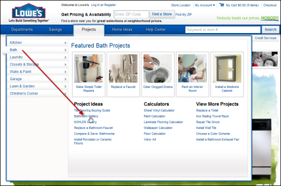
This type of game playing frustrates people when they are trying to get something done quickly. The Lowes website does a much better job for part of the experience but not all. Try going from the upper left part of the Projects tab to the Bath link on the left. Chances are the Savings panel will open while you are en route. However, once you are able to read the left hand menu for the Projects tab you’ll be able to very leisurely move your cursor to the Bathroom Gallery link under Project Ideas. In fact the delay may be excessive because it takes a little too long to trigger other left hand options. Always test with users to fine tune the optimal timing and interaction for each specific situation.

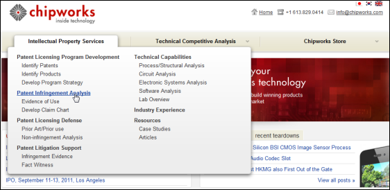
A good example of the best practices for timing can be seen on the Chipworks website. You can move the cursor up and down across the global navigation bar without triggering an unwanted mega menu. Pausing for a moment displays the mega menu. If you momentarily roll off the edge of the mega menu and quickly recover the mega menu will remain open. Finally, if you open one menu and then cross over one of the other global navigation tabs to get to the far side of the menu, the original menu will stay put.

In our experience, timing and speed of mega menu operations are absolutely critical to success. They can either make or break the experience. The algorithm must be smart enough to know when someone is moving to another link on a page, is trying to access the mega menu, or is still trying to navigate an open mega menu.
Timing and speed of mega menu operations are absolutely critical to success
Contact us at 613-271-3001 or email us if you would like us to help measure the effectiveness of your mega menus or website.
Additional reading:
Related articles
- Make your lists easier to scan
- Design landing pages to focus attention
- Mega-menu rapid prototyping and testing boosts task performance
“It’s easier to use an eraser on the drafting board, than a sledgehammer at the construction site.”
Frank Lloyd Wright


