We explore examples of how some higher education websites support their top tasks, with approaches that other web managers can learn from.
We and our Customer Carewords partners have worked on 24 higher education websites in North America and Europe. Educational institutions have unique challenges, but the basic design principles for educational websites – e.g. focusing on the top tasks of top audiences – are the same as for other websites.
On every website there are a small number of tasks that are way more important to visitors and to the business goals of the site than the other tasks. These are the ‘top tasks’.
Universities are no different. Future students (or ‘potential students’ or ‘prospective students’) are the lifeblood of any educational establishment. Without future students, there will be no future university. Attracting future students is highly competitive. It is the number one business goal of any university and its website. University websites often devote much of the home page, campaign pages and landing pages to marketing to future students.
From our research, we know that the top tasks of future students are:
- Find a program – seeing if there is a suitable program or course on offer
- Entrance requirements – general and specific to a course
- Finances – tuition fees, accommodation and other costs, grants and scholarships
Students find out about Universities from many sources. But if they don’t know a university, then the ‘Find a program’ task can be the most critical, because if the future students don’t find a program they are interested in, then the other top tasks will never occur.
Reduce the number of steps to ‘Find a Program’
A common approach to supporting the ‘Find a program’ task is to provide a series of links that take the visitor to the information they need. On many University websites, it can take 6 or 7 steps to get to program details from the home page.
But some sites reduce the steps, which is a good start. For example, the University of Vermont provides a link to ‘Majors, Minors and Graduate Programs’ in an ‘Academics’ drop-down menu on the home page. To find details of a Psychology Degree program, for example, the steps on this website are:
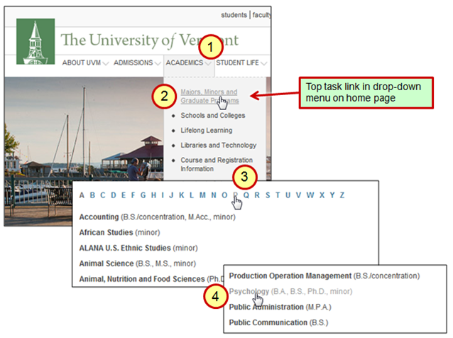
This is just four steps. But things can be improved further by applying some more design principles.
Position top tasks where people start looking for them
The University of Glasgow website reduces the steps from 4 to 3 (see below). There is a link to ‘Undergraduate degree programs’ right on the home page. So this link is not hidden in a drop-down menu, but immediately visible. And the link is to Undergraduate degree programs, so the destination list will be more specific than one that also includes post-graduate programs.
In addition, the link is placed in the top left hand corner of the home page – right where people start scanning the page for useful links.
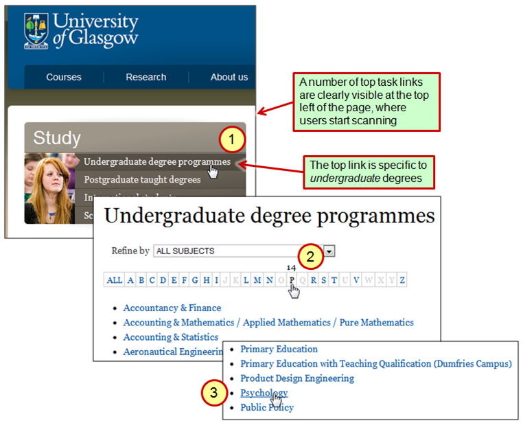
Glasgow has made the choice not to have a traditional promotional ‘slide show’ at the top of their home page, but instead to support the top tasks of Future Students.
Let’s not stop here – we can improve ‘Find a Program’ even further.
Start the ‘Find a Program’ task right on the home page
Users should be able to start the very top tasks right on the home page, or a relevant hub page or landing page.
To see how we might enable this, consider airline websites. Airlines have come to realise that visitors need to be able to start the top task – ‘Book a flight’ – right on the home page. Hotels have also realised that people need to be able to start the ‘Book a room’ top task right on the home page.
It took those organizations 10 years or more to recognize that fact. One can imagine the boardroom battles that took place before the senior executives agreed to have a form – a form! – on the home page, rather than glossy, soft-focus pictures of smiling people, planes and hotel rooms.
So why not let Future Students start the ‘Find a Program’ task right on the home page? Some Universities do this already. For example, to find information about a degree in Psychology on the Manchester Metropolitan University website, you use a ‘Find a course’ search function on the home page (see below).
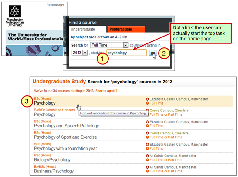
This search function has reasonable options and good defaults. The search box could be further improved by having auto-complete, to reduce spelling errors and eliminate the need to type long words.
Best practices are improving all the time, including best practices for search. Let’s look again at that airline ‘Book a flight’ task and see what else we could improve.
Progressive display of results
On most airline websites, visitors (‘Potential Flyers’, ‘Future Flyers’…) can immediately start typing the city name, or the airport code, etc. to indicate their departure or destination airport (see example below).
As the visitor types, the search function doesn’t auto-complete their search term; instead it progressively shows the set of results. They don’t even need to click a ‘Go’ button or press Return. This speeds up the task, reduces errors, and helps visitors determine what they need to type to zero in on the one airport they need.
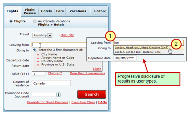
The Air Canada approach shown above works well to distinguish amongst the 178 airports that they serve. Most universities provide a similarly limited and fairly static set of programs and courses, which makes it an ideal problem-space to apply a ‘progressive results’ approach in a search tool.
This might seem to be the ultimate support for the visitors with the Find a Program task. But thinking more deeply about what the main goal of that task is can give us further ideas for improving our design.
Show ALL the results on the home page!
If you’re very lucky, you may be able to make this task even simpler. The DeVry Institute of Technology has two rollover elements on the home page which display their entire list of courses (see below).
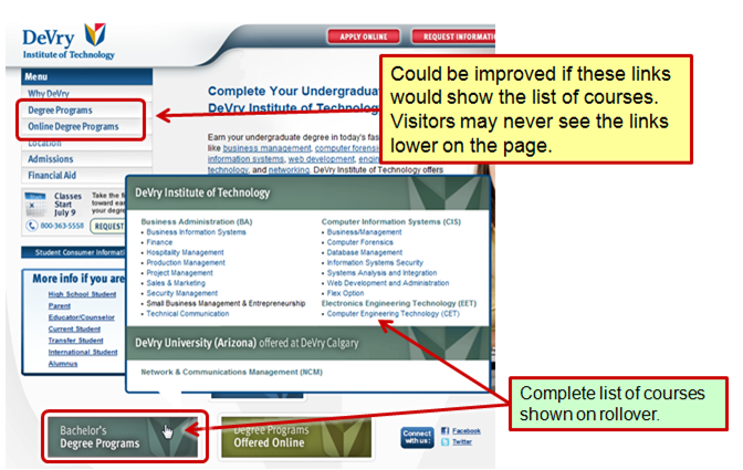
Of course, this only works if you offer a small set of options. But it’s a reminder that the best designs don’t only take account of the users’ top task needs, but also consider the nature of the solution space.
The DeVry approach could be improved further. The two navigation links at the top left of the page should show the lists. Visitors will be scanning for links; they will see those links first, click on one, and never see the links below. In addition, the fact that the rollover links are graphics means that some visitors will not ‘see’ them, because they look too much like advertisements, rather than links.
Support early task completion by disclosing key details
Getting to a Program or Course description isn’t the user’s entire task. A Future Student is trying to make a decision: ‘Is this the course and the university for me?’ Even while finding details of a program, information can be selectively provided to support that decision-making task.
Let’s take a look again at the examples above and see how these sites do – or do not – provide that additional task support.
The Glasgow Undergraduate degree listing merely includes ‘Psychology’ as a link. Bringing key details earlier in the user’s task can help them move on to the next task. Vermont provides a little more detail – ‘Psychology (B.A., B.S., Ph.D., minor)’ – so at least they tell their Future Students the types of degrees available. Sure, this means you may not have what the student is looking for, and so you get a shorter visit and fewer page ’hits’, but it’s a better experience than following links around only to eventually discover there’s nothing suitable.
Now look at the Manchester Metropolitan ‘Find a course’ results. They show the type of degree, whether they’re full time or part time, and on which campus they take place. With campuses distributed around the north of England, and with students increasingly staying at home in an economic downturn, location is probably a critical factor in the Future Students’ decision-making. This information also helps them decide more easily which of the many Psychology options to explore.
Each University may have different key decision-making details that could be provided early in the task, to simplify the decision for Future Students, helping them to find the most appropriate course as quickly as possible.
Design information around the task; borrow good ideas; improve on them!
Whether you manage a university website or not, a take-away message here is that you can borrow good ideas from other domains and apply them to your own website.
And you can improve on them. For example, consider how you might let users start their top task by providing a mini-application in the top left corner of your home page, with progressive display of results that includes supplemental information to support their decision-making. Do this and you’ll provide a better, quicker, less error-prone user experience than any of the individual examples we’ve looked at here.
If you go further, and understand the characteristics of your users’ task and the nature of the information needed to support that task, then you can design or re-purpose your information to better support that task, moving key information earlier in the task, and reducing the number of steps, time and effort to successful task completion.
Task-based design generates a uniquely powerful perspective on information.
Thanks, Bob!
We’ve often worked with Bob Johnson (@HighEdMarketing) on education websites, and highly recommend his newsletter: Your Higher Education Marketing Newsletter.
Bob pointed us to the Higher Ed examples we use in this article. To see more examples of higher education websites that Bob considers to be exemplary in various aspects, see his Link of the week list.
Do you know of better University Top Task practices out there?
We may have missed some University or College top task best practices. We may have missed your own best practices! Tell us about other University best practices, so we can include them in future articles.
Quote of the month
“Don’t get to the point. Start with the point.” Gerry McGovern


