This month we get back to some basics of website design – making sure your carewords are seen and used optimally.
People on the web are selfish, impatient and lazy. They want to accomplish their tasks quickly and with minimal effort. They don’t think, they don’t read, they click.
The essence and power of the web is the hyperlink. But what if people can’t find your links, are confused by your links, can’t remember which links they’ve followed, or click on things that are not links? This makes people have to think and work too much. They become frustrated. They don’t complete their task. They have a negative experience.
These types of problems should be well behind us by now. After all, it’s been almost 5 years since Jakob Nielsen published his definitive set of guidelines for link representation and behaviour. Unfortunately, all too often we see these guidelines violated, creating major problems. The good news is that these problems are some of the easiest to fix.
Put your website to the Link Visibility Test outlined below. Based on our experience we think you’ll be surprised by the results.
Problem 1: Can’t determine what is and is not a link
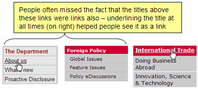
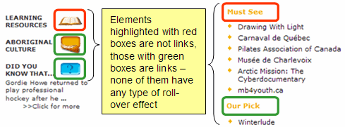
During a recent test, we observed problems with a main landing page that had over 40 links in a bulleted list in the middle of the page. Because the bulleted text links looked so similar to the surrounding body text many people simply scanned the page and left, never discovering the rich content hidden beneath each non-obvious link.
Here are a few other examples from recent projects that caused visitors grief:


Problem 2: Can’t determine which links have already been followed
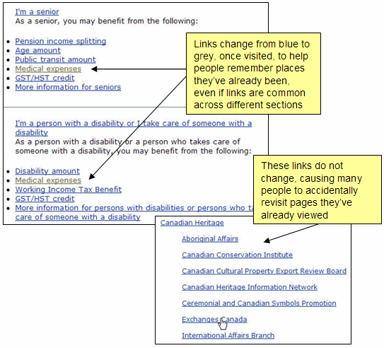
In situations where visitors will be exploring several different parts of your website it is important for them to know where they have already been so they don’t waste time going down paths they’ve already followed. In our testing we often find people becoming disoriented when visited links do not change colour – often going around in circles or unintentionally revisiting pages.
Being able to detect visited links also helps people who want to return to a page that they’ve recently visited. They can quickly scan the subset of visited links to find the one they want.
Help people out by changing the colour of visited links, especially for link lists or embedded links. This becomes increasingly important when link labels are similar or when the same link shows up on multiple pages, or even on the same page (as in the example below).

You may think this is not a big deal but try using an email system which doesn’t distinguish between read and unread emails. You’ll quickly understand the importance of tracking of previous interactions.
Problem 3: Can’t determine the content to which a link leads
There are two important attributes of a good link. It must be obvious as something that can be clicked and the label must help the user understand what content to expect. People shouldn’t have to read the surrounding paragraph to determine the meaning of a link. Remember, people don’t read, they quickly scan for links and click.
Although it is becoming more rare, we still see too many examples where the link label is totally meaningless. Here a click, there a click, everywhere a click-click! Here are two examples:
![]()
Unless someone has been hiding under a rock for the last 12 years, everyone knows what to do with a link. Don’t tell them to click, tell them what to expect if they click. Similarly, people would be very disappointed if they didn’t get more from clicking a link so tell them what to expect. Both of these examples also fail to meet the most basic accessibility need – providing meaningful link names for people using screen readers.


