As part of World Usability Day, Gord Hopkins and Gerry McGovern presented a webinar on “Designing Navigation with Task Management”. The full webinar recording can be downloaded from the Customer Carewords website. We had over 1000 people attend from 8 countries.
One popular topic covered in the webinar was contextual navigation. We have been observing a definite trend towards
providing more local,
task-specific navigation links while significantly reducing the number
of global links maintained on each page.
Why? Because, as Gerry Mc Govern has pointed out on several occasions…
“The primary purpose of web navigation is to help people to move forward. It is not to tell them where they have been, or where they could have gone.”
Amazon is constantly refining their customer experience,
including making changes to their navigation strategy.
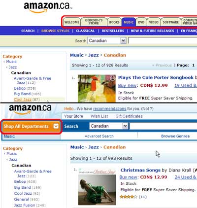
The top screen shot was taken about a year ago when
tabs for each major section of their online store were
maintained and repeated on all sub-pages.

The screen shot in the lower half of the image above shows their website today.
Once you have selected a department, for example “Music”,
all the global links to the other departments are represented
by the one global link labelled, “Shop All Departments”. This allows you to really focus on the task at hand.
All content and links are specific to the topic of interest.
Even the search box defaults to only search Canadian music.
There are links back to the parent nodes: Jazz and Music. However, the rest of the left navigation is specific to browsing Canadian Jazz music. It doesn’t make sense to offer links to books, DVDs, software, etc. after you’ve indicated your interest in Jazz. These irrelevant links would only serve to distract you from the task at hand and take up valuable real estate.
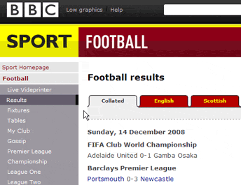
The BBC website makes good use of contextual navigation. Notice how once Sport and Football have been selected, those parent links are shown on the left but all other navigation is specific to Football. You no longer see links to News, Weather, Radio or TV.

People are impatient on the web. They are in a hurry.
They want to get things done. And, they do not want you to waste their time.
Anything that slows them down will frustrate them.
Links are like highway road signs, helping people move closer to their goal. But, if you were racing through a website at 100 km/hr which of the following signs would be more useful?

The signage on the left is all that is needed at this juncture — a simple and quick decision between two options. Too often web navigation includes links to a huge range of potential destinations, most irrelevant to the current task and decision.
With the signage on the right, it would certainly take you much longer to scan the signs and determine relevance to your current task. You would also likely make more errors and/or get distracted.
Remember, each new element you add makes existing content more difficult to find. Once someone has chosen a path, only present those links which are immediately relevant to that stage of the task. Also make sure that the words used for your link labels are those your visitors are expecting.
Get people onto the desired task path as quickly as possible, maintain links to the parent nodes for the content page they are on, then remove all other global navigation which is irrelevant to the current task.
Remember, on those rare occasions where someone wants to change context, it is only one click back to Home or a major hub. The trade-off is between providing contextually-relevant links and information versus the effort of changing contexts.
Email us or give us a call (613 271-3001) if you need help determining your tops tasks and/or the most appropriate navigation scheme to use for your website.
See our August newsletter for navigation best-practice suggestions.
Quote of the month
“Although it has some limited use, global navigation is overrated. Contextual navigation offers much more value, providing direct links to elements that are highly relevant to the user’s current location (and presumably their current interest [task]).” – Jakob Nielsen, 2004
If you have any comments
on The Insighter, or ideas on usability topics you’d like to
hear about, fill out our 2-question feedback, or send us an email
with your comments.
We invite you to subscribe to our monthly e-newsletter.


