Neo Insight’s e-newsletter
on Usability topics and techniques.
We invite you to subscribe
to our monthly e-newsletter.
Upcoming
events
| Feb 19-22, 2008 | UX Intensive, San Francisco |
| Mar 26-28, 2008 | Web App Summit, Coronado Island, California |
| Apr 21-22, 2008 | MX Managing Experience, San Francisco |
In this issue
- Manage the task, not the website – Gerry McGovern shares how to do it
- How to break just about every usability guideline in one website
- Help feed the world this Christmas
- Save $100 on our next two one-day workshops!
Due to the overwhelming number of people asking when Gerry McGovern will be returning to Ottawa, we are looking into the possibility of having Gerry visit again in early May, 2008. If you or someone you know would be interested in attending a follow up Masterclass, or a one-day session for senior managers, please let us know at or 613 271-3001, so we can gauge the level of interest.
Manage the task, not the website – Gerry McGovern shares how to do it
Gerry McGovern, author of “Killer Web Content”, shared his expertise with over 280 attendees during his recent 2-day Masterclass in Ottawa. The topic was creating and managing customer-centric websites.
|
Listen to more of Gerry’s gems of wisdom in this 23 minute interview Mike conducted prior to the Masterclass.
|
|
|---|
Two of Gerry’s key techniques involve learning your customers’ language and tasks. Understanding the language of your user is part of his Customer Carewords technique. Using this information to determine the key tasks people are trying to accomplish on your website is part of his Long Neck technique. See our August newsletter for more on Customer Carewords and the Long Neck.
“Focus on the top tasks and do them really well”
Many of our clients are considering redesigning their websites but often feel overwhelmed by the perceived magnitude of such an activity. By understanding the Long Neck, a clear focus can be developed. In some cases, focusing on 3 to 5 key tasks can positively impact 70 to 80% of customer experiences.
Gerry describes how web management has evolved over the last 10 years. In the beginning, website management was all about finding the right tools, like FrontPage and Dreamweaver. This allowed web pages to be created with much less effort.
Then focus changed to content management. Content management systems help separate content from presentation, and make it even easier to publish content to the web. However, they do little to control the quality of the content. As a result the web has become a dumping ground of content that never seems to go away. This makes it increasingly difficult for people to find the information they want.
“For every item added you make it more difficult to find the existing content”
Unfortunately, many companies are good at generating content, but are NOT very good at reviewing content, refining it to suit customer tasks, or removing it when it is no longer useful. The website becomes an endless attic full of cobwebs.
If you feel your website may suffer from unconstrained content proliferation, don’t feel alone. Microsoft reviewed their massive website and found thousands of pages which had never been accessed. They removed more than 60 thousand pages and never got one complaint or question. What are you waiting for? It may be time to clean house.
The people managing the UCLA website spend 80% of their time reviewing and improving content and only 20% of time creating content. Unfortunately, it is often easier to get a budget for creation of new content than for reviewing, refining, and culling existing content.
The best way to inform website management decisions is by observing your customers. Nothing provides better insight than watching the trials and tribulations of your customers as they try to complete tasks on your website.
Sam Walton (Wal-Mart) and Ray Kroc (McDonald’s) built their businesses by observing customers. They could never have developed the sophisticated operating and delivery systems of their successful companies without spending much of their time on the shop floor, observing, experimenting, learning, and modifying as they constantly honed the customer experience.
“Manage the task, not the website”
Web managers are learning to manage tasks rather than just managing content. Managing customer tasks is the key to successful customer-centric website design. The tasks are rarely well supported by just technology and content. It is the ability of your customers to complete their tasks quickly and effectively which ultimately determines the quality of the customer experience.
Successful task management requires more than analysis of web metric reports. It must involve observation and testing of people trying to complete tasks. Often you’ll find that people’s tasks cut across several parts of your organization. Thus managing by task, rather than content, is also a good way to break down organizational silos.
We’ve been observing website behaviour for years. We’d be happy to help you find ways of incorporating these techniques into your organization.
Related articles:
- Taking your first step with “customer carewords” (September, 2007)
How to break just about every usability guideline in one website
Recently, I was trying to select a nice restaurant with a varied menu. So I Googled a few places and had a look at their menus online. However, during the process I ran into one restaurant which obviously wanted to get in the way of me completing my task. Here’s just a few of the usability violations I encountered.
First, I was confronted by a splash screen with a big “Enter Site” button and a “Download Flash” button. I already knew I was in trouble. No help with my task yet, just a blocking move.
Next, I had to wait for 17 seconds (even on a very high-bandwidth cable connection) for the Home page to load. When the navigation bar first appeared, I tried to click on “Menus” but just as I went to click, the navigation bar ran away from my cursor. It animated to the bottom of the screen and then back up again, making it impossible to do anything until the website was finished settling down.

Reading links on the Home page was challenging. They couldn’t be scanned quickly because of their low contrast, use of capital letters, and strange angles. Worst yet, I couldn’t see that there was actually a phone number, which might have freed me from this torture, because it was hidden just off the bottom of my 1024×768 display and there was no scroll bar.
What’s the point of having a Home page with no visible content relevant to customer tasks? I didn’t feel any closer to Paris!
There is lots of room to provide direct links to the Dinner, Lunch and Dessert menus, provide directions, their phone number, and special offers. Why hide everything?
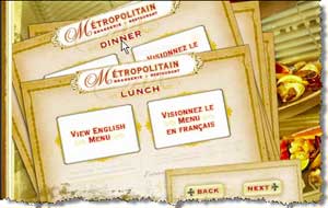
Well, being more dogged than most people, I clicked on “Menus” again. After leisurely watching another “Loading” animation for 23 more seconds, the menus appeared. Can you say “high blood pressure”? During the animation I saw the Dinner menu fly by but it ended up under the Lunch menu. No problem, I’ll just click the Dinner menu which was still partly visible. No such luck, clicking on the Dinner menu did nothing.

Then I spotted the “Next” and “Back” buttons below the menus. I finally managed to get the Dinner menu on top. But wait, this isn’t the menu; it is just a link to the Dinner menu. When I clicked on the link, I encountered a dialog asking if I’d like to save or open a PDF. At this point I had had it and moved on to other restaurants on my list.
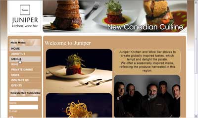
The next restaurant’s website was a pleasant surprise. No splash page, only three seconds to load the Home page, a clear Menus link on the left and relevant pictures showing food. One click on Menus and one more on Main courses and I had completed my task in less than 7 seconds.

Other usability issues I found on the first website (while exercising my masochistic tendencies) included:
- Pictures of the restaurant to choose from but they are all labelled “View Image” with no indication of what you will see.
- Making an online reservation requires navigating through 4 pages and having to register on the site.
- Use of the browser Back button takes you all the way to the Splash page, no matter how far through the website you have progressed.
- Page title is “main”. Not very distinguishable if you bookmarked the page and certainly not going to help with search engine optimization.
Don’t let this happen to you. We’d be happy to discuss how to improve your customer experience.
Related articles:
- Are you designing for user goals or just tasks? (February 2006)
Help feed the world this Christmas
Last month, a friend introduced me to an excellent example of a website providing a good experience. The website is called Free Rice. The website generates a series of words and you choose the definition from a set of four alternatives. Every correct answer generates 20 grains of rice to be donated via the United Nations World Food Program.
The site activities are sponsored by companies such as Apple, Enterprise, Macy’s and Lego.
The Free Rice concept is simple, yet ingenious. You help reduce world hunger, improve your vocabulary, and have fun; plus the sponsors get exposure. What more could you ask?
Our next workshops
| February 21, 2008 | Designing usable Web-based applications – One day Workshop. |
| February 28, 2008 | Usability challenges of new Web technologies – One day Workshop. |
Our workshop “Designing usable Web-based applications”, takes place February 21, 2008. Web applications are becoming as powerful as the ones on our desktop. High-value web applications focus on making users more productive in accomplishing their goal or task. Join this workshop to explore the usability challenges in designing web applications. Come away with tips, techniques and current best practices for enabling your users to fulfill their goals effectively and efficiently.
Our one-day workshop “Usability challenges of new Web technologies” takes place on February 28, 2008. We will review many live Web 2.0 examples and explore how to adapt traditional usability techniques to design and evaluate the new generation of web user interfaces.
Early registrants save $100. Save even more for group bookings. Take advantage of further discounts and call us to run either workshop at your location for five or more people: (613) 271-3001.
Quote of the month
“Most websites face the same basic problems, for which there are the same basic solutions. There are now solid rules for managing websites. The first one is: Design for what is common, not for what is exceptional.”
Gerry McGovern, NEW THINKING eNewsletter, 2007
If you have any comments
on The Insighter, or ideas on usability topics you’d like to
hear about, send us an email
with your comments.
We invite everyone to subscribe to the Insighter,
our monthly e-newsletter.
If you wish to unsubscribe,
just send
us an unsubscribe email.


