on Usability topics and techniques.
We invite you to subscribe
to our monthly e-newsletter.
| February 22, 2007 | Usability challenges of new Web technologies – One day Workshop. Save $100 if you register before February 9. |
| March 8 , 2007 | Designing usable Web-based applications – One day Workshop. Save $100 if you register before February 23. |
Upcoming
events
| April 13, 2007 |
CapCHI one day workshop: “Web 2.0″ The Human Web” with Peter Merholz of Adaptive Path, Maggie Fox, Derek Featherstone, and our own Mike Atyeo. See more details below. |
| April 28 – May 3, 2007 | CHI2007 “Reach Beyond”, San Jose, California. |
| July 18-20, 2007 Pittsburgh, PA |
2007 Symposium On Usable Privacy and Security (SOUPS), including a Neo Insight Usability Evaluation workshop. |
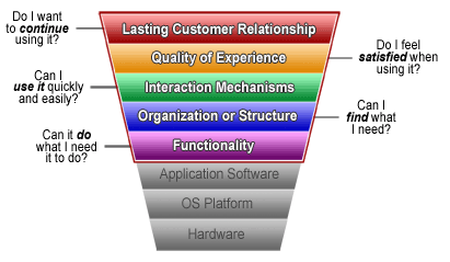
We apply our model of customer experience to describe and to predict many things. Working top-down, it explains how a management vision connects to – and drives – technical development. Working bottom-up, it explains why functionality and characteristics need to be in place.

In a recent usability review of a geomatics web interface, we were reminded of the intimate connection between the layers of our model, and the impact of low-level design details on the ultimate success or failure of an application. Let’s look at what we found, and illustrate how just a few of the details of the organization and interaction conspired to feed up the layers and damage the overall experience and the long-term relationship with customers.
In our experience, every website has the goal of developing a long-term customer relationship. This might take the form of, for example, repeat sales; or perhaps annual upgrades to software; or repeat visits which allow the site to sell more advertising; or simply where the primary value to the user only comes from long-term use. For a government geomatics application, a long-term relationship is necessary to meet a performance-oriented goal such as “improved land-use decision-making”. That’s the kind of practical, measurable outcome we like to get our teeth into, as it has direct implications for usability and the customer experience.
Geomatics applications can be highly interactive and tightly integrated. They often need to support well-defined user goals and tasks. In the mapping interface we tested, users have to learn a few key concepts. They have to learn what layers are, what they contain, how their contents are represented and how they can be grouped into contexts. Users also have to learn how to make layers visible on a map, and what it means for a layer to be visible and active, and how these two concepts relate.
Just one usability test was enough to show how usability issues at the detailed design level feed up through the layers to impact conceptual understanding and the decisions made with the mapping data – the business goal of the application.

During the course of that particular test, the user did what everyone does – he built a partial mental model of what was going on. People don’t develop full models; they only need enough to 1) explain their experiences so far (what they remember of them anyway), and 2) help them predict what will happen if they carry out certain actions (the main purpose of the model).
 Problems we saw included:
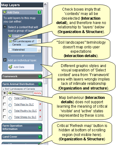
- Visual separation of functional areas such as the ‘contexts’ and ‘layers’ prevented the user from developing a clear understanding of how they relate to each other.
- Unpredictable presentation of map updates made it difficult to model when actions and selections were being taken into account.
- Unpredictable presentation of layers made it difficult to understand when any particular layer was visible.
- Identical representation of the content of different layers (see illustration above) made it difficult to understand what ‘active’ and ‘visible’ mean.
- A key interaction component – the ‘update map’ button – was hidden at the bottom of a scrollable region.
In this test, the user arrived at two erroneous conclusions before (and only with encouragement) he achieved his goal. In a real-life situation, most users would believe they had already achieved their goal – albeit with some difficulty – and would have drawn the wrong conclusions: they would have made worse land-use decisions.
Three morals of this story
- The devil is in the design details. This is especially true with a tightly-integrated application such as a mapping interface. The host of detailed design decisions in such an application must be driven by a clear understanding of user goals and behaviour, and must be designed explicitly to support the conceptual understanding necessary for a successful application.
- Sometimes just one user is enough. Sometimes, with just one user, you see enough to know that further usability testing should be put on hold until some major issues are resolved! But you can’t plan for that one user; that’s why we recommend planning for one day’s-worth of testing (around 6 – 8 users), with sufficient time to make those obvious, head-slapping (duh!) changes before the next round.
- Usability testing always adds value to heuristic evaluation. A usability expert who examines an application or website will identify many usability issues. It’s always worthwhile doing this before doing usability testing. But don’t make the mistake of considering heuristic evaluation as a replacement for usability testing. It is important to observe the unique interaction journeys that users take. These journeys highlight generic usability issues, and integrate all the individual usability issues into a complete experience that helps you understand the big issues – those which directly support or damage your lasting customer relationship.
Our experience with hundreds of usability tests and heuristic evaluations like this one allows us to extract the insights, to separate the systemic architectural issues from the individual details of interaction, and to design solutions that support your customers’ experience and develop your long-term relationship with customers and users. Call us to evaluate or design your Customer Experience – 613 271-3001.


