on Usability topics and techniques.
We invite you to subscribe
to our monthly e-newsletter.
| November 30, 2006 | Usability challenges of new Web technologies – One day Workshop. Save $100 if you register by November 17th. |
| December 7, 2006 | Designing usable Web-based applications – One day Workshop. Save $100 if you register by November 24th. |
Upcoming
events
| November 14, 2006 | World Usability Day – Come see us at the RA Centre. Participate in the e-Government Showcase in the morning or the Usability Showcase and Trade Show in the afternoon. View the program. There is still opportunities for exhibiting and/or sponsoring. |
| November 22, 2006 | CapCHI Meeting – “The Canadian Copy-Fight: Copyright, Culture, and the Internet” with Michael Geist from University of Ottawa at the Ottawa Public Library. |
| April 28 – May 3, 2007 | CHI 2007: Reach Beyond – Annual Conference of the Special Interest Group in Computer-Human Interaction, San Jose, CA |
Special event – AJAX and Usability Presentation
| Mike Atyeo, President of Neo Insight presented on AJAX and usability to a large crowd at a recent CapCHI meeting in Ottawa. Mike’s talk covered both the benefits and pitfalls of using AJAX technologies, with numerous examples of various usability issues associated with some of the current crop of AJAX applications. After the talk, Mike sat down with Jeff Parks and created a Podcast which captures some of the highlights of the evenings presentation. You can download the slides (8MB) from the CapCHI web site. |
As the web evolves from a data dissemination tool to providing transactional services and complex applications, usability evaluation and design is becoming more and more important. The simple hypertext link model is giving way to increasingly rich interaction models which include sliders, drag-and-drop, zoom and pan, etc. RIAs let users perform complex tasks without re-loading pages, and offer users direct manipulation, better visualization of data, and more. They make a web page into a mini application. Thus, to be successful, RIAs increasingly need to draw upon the established user experience design principles and guidelines previously only associated with desktop applications.
Map technologies are working, now the challenge
is in getting the overall user experience right
Most of the challenges in developing RIAs are design related, not technological. Moreover, the design decisions made with respect to the user experience often provide the critical competitive advantage, especially given the similarity of feature sets in many of today’s web-based offerings. Whoever masters the overall user experience will have the advantage!
Comparing mapping applications like Google Maps and Yahoo’s Map Beta, we see many similarities. But we also see they are still working out a number of critical interactions affecting the user experience, in such basic things as users entering data, searching, or zooming.
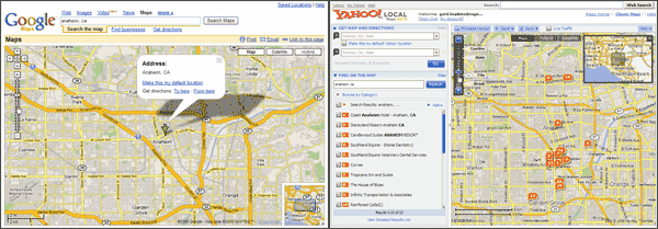
Both show similar maps with a field to enter in a new location. Yahoo decided to show hotels by default. With Google you have to type in your request “hotels in anaheim, ca”. The side panel on Yahoo can be hidden but then you can’t enter a new area without reopening the panel. Google shows their maps full width and people can keep entering different locations. With Yahoo, you can immediately swap to the upper two input areas to get directions. Using Google, you have to navigate to the “Get Directions” page. Which user experience is better depends on the task.
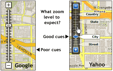
Other important differences show up in the usability of the zoom feature. On Google, there is no indication of what you might see at each of the different zoom levels. With Yahoo, a partially transparent overlay appears, when the cursor is near the control mechanism, showing what zoom level to expect. It also is oriented to match the user model of zooming down to the details. The Google model is the opposite. You zoom up to the highest level of detail but the cues are not as salient.
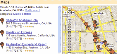
Although both applications provide roughly equivalent details regarding hotels in the area, only Google displays the critical information (address and phone number) in a panel on the left without requiring clicking through to each hotel separately. It would be nice if they supported people sorting the hotels based on price, distance from the location entered, rating, etc.
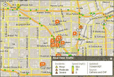
Each application can support additional overlays of information for more specific needs. For example, the Yahoo application allows people to overlay a live traffic report summary, showing travel conditions and the location of accidents or traffic problems.
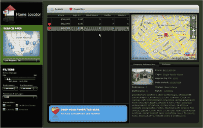
Exploiting the power of combining mapping information with information databases, ASFusion has created an interesting real estate search application. To experience the Home Locator application you will require Flash Player 9.
Sophisticated map interactions can happen
without re-loading the web page
Instead of navigating from page to page, all the interactions occur on the same page. First you select the geographic area from the map on the left, then you filter based on price range, number of bedrooms and bathrooms, the square footage, and amenities. As you filter, the middle column is dynamically updated with any homes that match the criteria. Clicking on a home of interest centres the map in the top right around the property location and displays the property information or house pictures in the bottom right. People can collect their favourites by dragging and dropping them into the blue favourites area at the bottom.
Web maps are are evolving into
rich interaction environments
Although this is just a prototype, it provides a good feel for the direction that web-based applications are heading. They are moving away from a page-based metaphor. These kind of RIAs use an interaction environment well suited to user’s needs to get an overview, zoom and filter, and see details before finalizing a transaction. Obvious functionality missing includes the ability to view and print favourites, do side-by-side comparisons, filter based on neighbourhood, etc.
New tools are emerging to permit the design of powerful, interactive web applications. We’ve talked about AJAX and usability in our July 2006 newsletter and Mike Atyeo recently gave a Neo Insight presentation on Ajax and Usability which also includes an associated podcast. The Home Locator application was created using Adobe Flex 2 which is based on Flash. Flex 2 enables rapid development of RIAs for almost any platform and, due to the almost ubiquitous browser support of the Flash Player, it provides a very attractive development environment.
Microsoft Vista will be accompanied by other promising development tools, namely Windows Presentation Foundation Everywhere (WPF/E). Microsoft is fine-tuning its graphical user interface subsystem that will be part of the soon to be released Windows Vista operating system. WPF/E is a subset of this subsystem based on eXtensible Application Markup Language (XAML) and Javascript. It includes vector-based drawing, transparency, hardware acceleration, etc. The most interesting part is that it purports to support a wide range of platforms, including the Mac and Linux.
As this trend towards more interactivity and rich media continues, it will become more and more important to focus on the usability of these map-based applications. The trends are making it more efficient for users to interact with map-based web sites, and providing more direct ways for users to manipulate interaction mechanisms. The new interaction environments offer an alternative to traditional page-based metaphors like navigation, browsing, and searching. Now the challenge is in getting the user experience right as map-based applications still vary widely. Ultimately, the only way to know if your application works well for users or is better than your competitors is through testing.
Both of our upcoming workshops Usability challenges of new Web technologies and Designing usable Web-based applications address these trends and the challenges of designing for usability in these environments.


