The Insighter

July 2008

View all articles on our new site

Neo Insight's e-newsletter on Customer Experience topics and techniques.

         
We invite you to subscribe to our monthly e-newsletter:

In this issue


Upcoming events

September 10, 2008 (10am EDT)

Free online webinar: Task Measurement

September 16, 2008

"Protecting the data double: A case study of identity theft", talk by Jennifer Whitsun, at the next CapCHI meeting, Ottawa.

October 13-16, 2008 User Interface 13 Conference, Boston MA
October 13-15, 2008

10th ACM Conference on Computers and Accessibility, Halifax, Canada


Managing your users' tasks: 6 measures you need to know

We've talked before about why managing a website is about managing users' tasks, not managing technology or content. Managers who adopt this emerging perspective are making a number of changes to their organizations, including:

  • Identifying their top user tasks (for Internet, Intranet, or desktop application)
  • Reporting to senior management on task metrics
  • Assigning responsibility for the success of each top user task to staff
  • Developing performance measures and benchmarks based on user task performance
  • Setting annual task performance improvement targets

Over the past few months we've been working with our Customer Carewords partners - in particular Rolf Molich and Gerry McGovern - to build and refine a set of usability benchmarks and metrics, and a cost-effective process for measuring them. These metrics are equally applicable to websites (Internet, Extranet and Intranet) and desktop applications, because they're about the users' tasks, not the technology. We now have an efficient methodology and sophisticated behind-the-scenes analysis software to produce key benchmarking metrics.

There are a number of measures, and we're still improving the measures and the process, but here, in brief, is a summary of the 6 key Task Performance Indicators™ (TPI) - the measures you should really know about your users' top tasks.

The first 3 measures we'll cover focus on the task performance itself:

1. Completion time
This is the median time taken by participants to complete a given task. The ideal figure depends on the task and, sometimes, on experience or training of the users. As our process is focused on benchmarks, the facilitator of a TPI test session does not intervene with questions, or ask the participant to "think out loud". The facilitator still makes behavioural observations, and we still deliver recommendations for improvement of task performance, but the process differs from our traditional qualitative usability tests, which we still offer.

2. Completion rate
Completion rate is the percentage of all participants who complete the task successfully. The test sessions should focus on high-value tasks, typically very frequent and/or critical tasks. For this reason, ideal completion rates are probably going to be close to 100%. In fact, deciding which of your users' top tasks need a 100% success rate is a good way of deciding which tasks should be tested!

3. Disaster rate
In usability tests, particularly of information-focused websites, we have often come across the situation where users complete a task quickly, give very high ratings of satisfaction, yet come up with the wrong answer! This situation, for a website or application that is mission-critical, is a disaster! Yet traditional usability measures would not reflect this - in fact, they would be erroneously skewed. So we measure this 'Disaster rate' separately. If you're measuring the important tasks - your users' top tasks - the ideal Disaster Rate will be 0%.

The next 3 measures help managers prioritize their actions by estimating potential savings and productivity benefits from improving the task performance.

4. Optimal task time
Following a round of testing, we present a set of recommendations, and provide a sophisticated analysis of the measures described here plus others. From these data, we work with our clients to make estimates as to the optimal task completion times and rates if the user interface or website were to be improved to a realistic degree. These essentially become targets for the next round of Task Performance Indicators™ - perhaps carried out as annual becnhmarks, or as part of a product release or Quality Assurance process.

5. Frequency
We ask test participants how frequently they carry out each of the tasks. We take these figures and validate and refine them with our client to create an estimate of how often the tasks are performed in the organization, or by all customers or website visitors. Our clients are looking to manage the top priority tasks, for maximum productivity or to maximize conversion rates; these will almost always have a high frequency.

6. Potential return
This is a calculation of how much money and time can be saved or made by improving the efficiency of each task. It takes into account all the above measures and others (including, for an Intranet or application, the loaded labour rates of the people who carry it out), to produce a projected Return On Investment for improving the task performance. For the top Intranet tasks, savings of a few seconds can often save large organizations millions of dollars each year. For commercial sites, seconds saved, or disasters and frustration avoided, can result in increased sales and more loyal customers. For government sites at all levels, improvements result in increased productivity of citizens, and, therefore, a more efficient economy.

The testing process is similar to traditional qualitative usability testing, in that key tasks are defined, and representative users are identified and recruited. However, whereas traditional testing often requires only 6-12 users, testing for Task Performance Indicators™ requires more users – typically around 20 per round.

Analysis is carried out by a unique method which takes into account the complete set of measures, to weight, summarize, rank and prioritize the results. The many years' of experience of all the Customer Carewords partners also means that we have large amounts of data for cross-industry comparison or competitive analysis.

To find out more about Task Performance Indicators™ and other ways to manage tasks on your website, email us, visit the Customer Carewords website pages on Task Performance, or register for the free webinar on September 10th.

Related newsletter articles:

Back to Top


Jing - free image & video capture & share tool - just got bigger and better! Jing logo - link to http://www.jingproject.com/

We last talked about Jing in our July 2007 newsletter. We're always capturing screen-grabs and videos as we work - either when we're doing an expert usability evaluation for current clients, or when we come across a particularly interesting (!!!) website or application. Jing is one of the tools we use for that. We've also used it to capture some complex application bugs, and to share them on ScreenCast.

A TechSmith offering, Jing is similar to their SnagIt and Camtasia Studio products, but is a FREE (we like that!) lightweight, pared down tool, offering always-on, instant capture, annotation and sharing functionality on either Mac or PC.

Jing output can be saved to a local folder, to an ftp server, to ScreenCast, or to pretty much anywhere. TechSmith have just upgraded the complimentary ScreenCast account that Jing users get, to 2 GB of storage and 2 GB of transfer bandwidth per month.

Find out more in the Jing FAQ, or the Jing blog .

Back to Top


Early prototyping tools: Balsamiq, Axure...?

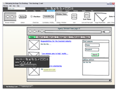
Balsamiq screen-shot.
Balsamiq screen-shot

While we're on the topic of tools... We're always on the lookout for better design tools, especially for producing early mock-ups, interactive prototypes and wireframes for early validation and usability testing. One that caught our eye recently is Balsamiq, produced by Giacomo Guilizzoni (aka Peldi).

Built on top of Adobe's AIR framework, Balsamiq looks like a neat, simple low-end tool for rapid website mock-ups. In fact, after just a short use, we mocked up a page layout in just 10 minutes during a meeting (see Web page mock-up)!

Here's what we like from our first impressions:
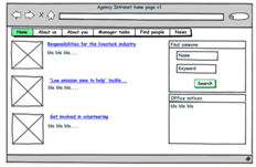
    Web page mock-up produced with Balsamiq.
    Web page mock-up
  • It's very quick and mostly pretty intuitive to use
  • It contains most of the components of web pages you'd need
  • It looks hand-drawn, so users (and the design team) will be more willing to critique the design, and will not be tempted to comment on irrelevant visual details
  • Components such as links, radio buttons, check boxes etc can represent their states (e.g. selected/unselected/unavailable)
  • It would be
    Example interactive wireframe.
    Example interactive wireframe
    easy to use in a meeting, working with other team members and users to iterate design ideas
  • It would be easy to produce paper prototypes from Balsamiq

One issue we'll be thinking about is how Balsamiq might provide more support for moving to the next stage of design - interactive prototypes or wireframes (see the recent project example). Balsamiq saves images and XML layout descriptions, not HTML, so the challenge would be to support interactive output without making Balsamiq overly-complex.

We certainly intend to use this on design projects, so you should see a more detailed review in a future newsletter. Do tell us about your own experiences with Balsamiq, Axure, or other early-stage design tools, and we'll try to include your comments in a future newsletter.

Back to Top


Free webinars: Task Measurement; Educational Sector

Task Measurement – September 10th

How long does it take people to complete top tasks on your intranet or website? The longer it takes the more frustrated and impatient they will become. Many of them will simply give up and slam the virtual door when they leave. It is surprising how many people cannot complete the most basic of tasks on a website.

In this webinar you will hear Gerry McGovern and world-renowned usability expert, Rolf Molich, speak live on how we do Task Measurement and compute our unique Task Performance Indicator. The webinar will also explain how you can increase productivity significantly by systematically managing the top tasks on your website.

This FREE webinar from Customer Carewords takes place on Wednesday September 10th, 2008 at 10:00AM Eastern Daylight Time (EDT)

Register now for this free Task Measurement webinar

Educational sector websites - Customer Carewords – October 8th

Hear Gerry McGovern and Bob Johnson (our educational sector expert) speak live on how you can increase key audience engagement and generate higher conversion results by better managing your website. .

This FREE webinar from Customer Carewords takes place on Wednesday October 8th, 2008 at 10:00AM Eastern Daylight Time (EDT)

Register now for this free Task Measurement webinar

Back to Top


Quote of the month

“A general principle for all user interface design is to go through all of your design elements and remove them one at a time. If the design works as well without a certain design element, kill it."

Jakob Nielsen adpated from Antoine de Saint Exupery


If you have any comments on The Insighter, or ideas on usability topics you'd like to hear about, fill out our feedback form, or send us an email with your comments.


We invite you to subscribe to our monthly e-newsletter.


  Home   About Us   Services   Case Studies   Training   Teamworks