Neo Insight’s e-newsletter
on Usability topics and techniques.
We invite you to subscribe
to our monthly e-newsletter.
Special event – Creating Customer-Centric Websites
| Due to the amazing response, we regret to say we can take no more registrations for this event. Subscribe to our newsletter to make sure you hear about our future events. |
|---|
Masterclass presented by Gerry McGovern,
World-renowned Web content and usability expert
 Your chance to hear the best speaker on Web content management in the world is just around the corner. Gerry McGovern is an inspiring, thought-provoking and humorous speaker who will give you practical ways to achieve your objective of providing great Web content.
We’re excited to announce that Neo Insight, in collaboration with the Ottawa Centre for Research and Innovation (OCRI) and Canada Business, Industry Canada, will be hosting this rare appearance by Gerry McGovern in Canada.
November 28-29, 2007
Library and Archives Canada, Auditorium
395 Wellington Street
Ottawa, Ontario, K1A 0N4
Seating is limited so reserve your seat early!
Complete details about the Gerry McGovern Masterclass
Our
next workshops
| Oct 4, 2007 | Usability challenges of new Web technologies – One day Workshop. Save $100 if you register before September 21. |
| Oct 11, 2007 | Designing usable Web-based applications – One day Workshop. Save $100 if you register before September 28. |
Upcoming
events
| Nov 5-8, 2007 | User Interface 12 Conference, Cambridge, MA, USA. |
| Nov 8, 2007 | World Usability Day – Ottawa, ON, Canada |
| Nov 12-15, 2007 | UX Intensive, Vancouver, BC, Canada. |
| Nov 28-29, 2007 | Gerry McGovern Masterclass, Ottawa, ON, Canada |
| Dec 2-7, 2007 | User Experience 2007, Las Vegas, NV, USA. |
In this issue
- Gerry McGovern’s customer carewords and the Long Neck
- How to squeeze a great customer experience out of a long list of links
- World Usability Day 2007 – Ottawa
- Save $100 on our next two one-day workshops!
Gerry McGovern’s customer carewords and the Long Neck
Gerry McGovern is recognized as a leading authority on managing web content as a business asset. We are very happy to be hosting Gerry’s visit to Ottawa in November and wanted to share two of his key concepts as part of this month’s newsletter — customer carewords and the Long Neck.
Customer carewords
Customer-centric Web content is not just a “nice to have”, it is essential to a successful Web strategy. Gerry has developed a practical approach which helps organizations focus on their Web visitors and get away from the organization-centric perspective so common on many websites. One of his key techniques involves customer carewords.
Customer carewords are a small set of words and phrases your key customers care about (in the customer’s language), which they search for, scan for, and recognize as they complete a task on your website. In headings and sub-headings, in indexes, in links and in the main page content, customer carewords provide the guideposts which direct users towards their goal by helping them complete their tasks quickly and effectively.
Customer carewords are often incorporated into links, tend to be action-oriented, and are always in the language of the reader. For example, when trying to arrange travel, which phrase would you be more likely to have in mind when scanning a travel website — “Book a flight” or “Online Reservation System”?
Having the right words is what drives actions on your website. If you identify the critical customer carewords, they will jump off the page for readers, allowing people to easily find what they are looking for and quickly accomplish their tasks.
Gerry’s customer careword technique is a simple 3-step process which involves:
- Generating a list of potential carewords.
- Getting customers to vote for the words or phrases most meaningful to them.
- Analyzing the results to generate the most import set of carewords.
Using this simple technique allows you to collect the data needed to make informed decisions as to what content is critical to the success of any Web page or website. It allows you to focus on what your customers really need and want, and allows you to put an end to opinion wars about what should and should not be on your website. Most importantly, it allows you to simplify your website, making it more useful and easier to manage.
Carewords can be applied by many people involved in Web content:
- Content authors can use them to refine Web content, links in body content, or descriptive text near hyperlinks.
- Usability testers can use them to select tasks for testing a website.
- Business analysts can use them to gather user requirements or focus R&D on user needs.
- Information architects can use them to refine the navigational taxonomy or page structure.
- Site managers can use them to monitor performance of the site for key tasks and search terms.
The Long Neck
Similar to the ubiquitous 80/20 rule, Gerry has proposed the 25/5 rule which states that 5% of your website content delivers 25% of the value. The challenge is in knowing which 5%. This 5% constitutes the Long Neck and is where killer web content resides.
“Focus on exactly what your customer wants and don’t provide anything more.” Gerry McGovern
Gerry has found that there is usually a small grouping of half a dozen words or phrases — the carewords — which are overwhelmingly preferred by website visitors. Effective website management requires a continual process of addressing the user needs represented by the Long Neck.
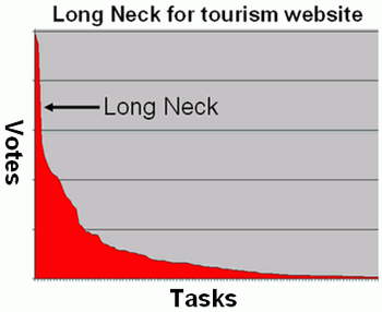
This graphic, taken from Gerry McGovern’s website, uses the tourism industry as an example. “In a customer carewords poll of over 1,000 people in 12 countries, people were asked to choose the tasks they most wanted to complete on a tourism website. 147 possible tasks were offered such as: planning a trip, vacation packages, getting here and around, accommodation, special offers, things to do and see, etc.”
“The top seven carewords, representing five percent of the total tasks, got 35 percent of votes. In fact, the top seven carewords got more votes than the bottom 120 carewords. This tourism Long Neck represents the essence of what a tourism Web site must do to be successful on the Web.”
Less is more
Successful websites such as Google, Amazon, Craigslist, Flickr or Netflix all have something in common. They do a few things really well and yet serve a very broad spectrum of people. Self-service models, especially, require simplicity. Serving too many customer groups with multiple needs can result in overly complex websites which are difficult to manage and a challenge to use. Even if your website is large, and your audience diverse, the customer carewords approach will help you bring the most important content to the fore, rather than it being lost amongst a mass of less important information.
“It is a fallacy that you can reach everybody on the Web. Try to reach everybody and you will certainly reach nobody.” Gerry McGovern
Do you have difficulty managing, prioritizing and organizing large amounts of information on your site? Do your visitors have trouble accomplishing their tasks? Would you like your content and information architecture to be more customer-centric, and less organizationally driven? If so, you will definitely want to join us at Gerry McGovern’s masterclass in November. Not only will you learn more about the power of customer carewords and focusing on the Long Neck, you’ll also learn practical techniques to:
- Improve your ability to design and manage large websites.
- Create a business case to get senior management involved in making Web content a core business asset.
- Improve the skills of the team writing and editing content for your website.
- Redesign the information architecture (metadata classification, taxonomy, navigation, search, layout and design) to allow content to be found and read easily.
Related articles:
- Web content is where the action is! (April, 2007)
How to squeeze a great customer experience out of long lists of links
We have found that applying concepts like Gerry McGovern’s “customer carewords” is particularly useful in helping clients understand how to tackle some of their design challenges. One such challenge is providing long lists of links to resources, tools, or forms, etc. Quite often, these lists are difficult to scan, or require knowledge of specialist terms before visitors can find the information they need.
One problem we’ve often encountered during our usability testing is confronting users with long alphabetic listings of links in which the phrasing actually interferes with them finding the content of interest. In the example below, how likely would you be to look under the As when you are looking for a database on Canadian Breeding Birds? Or, what is the likelihood of you’d look under the Cs for American Woodcock breeding habitat data? How about looking under the Es for Cattail Control Techniques?
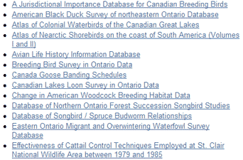
Not only is the use of familiar words and phrases important to help people relate to the content but they are absolutely critical when organizing a long A-Z index, otherwise people won’t even be in the right neighbourhood when scanning the list. Often you have to modify the phrasing to put the keyword at the beginning of the line so people can easily scan for it.
During numerous usability evaluations we have found long lists of poorly organized links which always frustrate users. One recent incident involved a list of over 300 links with no obvious means of organization. When we questioned why they were not organized in some meaningful way, we were told that they were actually ordered by document number but there was no document number in the title, nor is it of any importance to most people accessing this list.
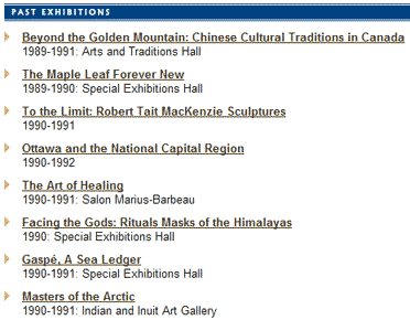
On another client’s website, they listed past museum exhibits in a long list. It was over 250 entries long. Major and minor exhibits were mixed together in chronological order. However, most users were trying to find exhibits by topic. Good luck! Try to find a past exhibit on Egypt, without knowing when it was on display, by scanning a list that starts out like shown in the example. Remember there are 250-300 items to scan, typically requiring over 20 page scrolls.
“More than 83% of Internet users are likely to leave a website if they feel they have too many clicks to find what they’re looking for.” Arthur Andersen
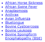
Even if the list of links is short enough to scan in its entirety, if the links do not contain customer carewords, they may never find what they are looking for. If you were looking for mad cow disease in the following list of links, does it jump out for you? And, no, it’s not under the M’s. People have to know that the formal term for mad cow disease is Bovine Spongiform Encephalopathy (BSE). If you’re expecting a range of visitors, provide both formal and common terminology.
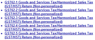
Examine the list below. How would you choose amongst the set of links? What is the difference? This is a very perplexing experience. The list is taken from a Canadian Government Web page which lists GST forms by form number. Take a look at that page and see if you can figure it out.
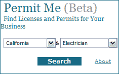
Often we find that long lists of links can be avoided by asking the website visitor to provide a bit of contextual information. For example, imagine you were looking for what licenses or permits you may need to start up a business. The list of potential licenses and permits required for all types of businesses located anywhere in the US would be extensive. A simple dialog, like the one shown, can quickly narrow the scope of options. If there were also requirements specific to your municipality, it may be better to ask people to enter a Zip or Postal Code.
Organizing links based on other contextual information, such as stage of business, can help people focus in on the subset of interest. If they find the customer carewords they are looking for, even better. Here is an example from a website providing guidance and tools to small business. You’ll notice that the links within a section are also loosely ordered in terms of a logical sequence of activities.

There are many techniques for helping people contend with a large set of links, including the use of customer carewords, grouping related links together, laying out the links so they can be easily scanned, requesting some contextual information first to narrow the options, and so on. Remember, organization schemes based on internal conventions or processes are usually not helpful to your customers, especially if the organizational principle is invisible.
If you come across some pages on your web site with similar long lists of links, observe a few users trying to accomplish typical tasks using these pages and you’ll soon discover if you have a problem.
Related articles:
- Are you designing for user goals or just tasks? (February 2006)
World Usability Day 2007 – Ottawa
World Usability Day 2007 is just around the corner – November 8th. This year’s theme is healthcare. The program for this year will include speakers from government and industry plus exhibits by local vendors of usability research and evaluation services. Some other special activities are still in the planning phase – so stay tuned to Ottawa World Usability Day website for the latest details.
The Ottawa event for 2007 builds on the success of last year’s activities which attracted 17 sponsors, exhibitors and supporters; over 250 attendees from academia, public and industry, including defense and security, e-business, software, life sciences, microelectronics/wireless, telecommunications, and more; plus media coverage on CTV news, CTV Tech Now, and CBC Radio Ottawa Morning Show, as well as an article in Carleton Now.
World Usability Day 2007 is being hosted by the Ottawa Usability Consortium (OUC), an organization of usability professionals and academics who promote usability through a range of activities throughout the year. To learn more about the OUC or to sign up as a member, please visit www.ottawausability.org or contact .
Volunteers are welcome. If you would like to help out with organizing this event, send an email to .
Sponsorship and exhibit opportunities also exist, but spaces are limited so sign up early. Visit the OUC website for details about exhibiting and/or sponsoring at this event.
Quote of the month
“The organization that succeeds on the Web is the one that puts the customer at the very centre of everything it does. A great website lets customers quickly do the things they need to do, rather than forcing them to do things the way the organization wants them to.”
Gerry McGovern, Killer Web Content p.194, 2006
Save $100 on our next two one-day workshops!
September 21 is the deadline for early registration in our one-day workshop Usability challenges of new Web technologies which takes place on Thursday, October 4. We will review many live Web 2.0 examples and explore how to adapt traditional usability techniques to design and evaluate the new generation of web user interfaces. Early registrants save $100. Save even more for group bookings. Come join us.
For our Thursday October 11 workshop Designing usable Web-based applications, sign up before September 28 for the early registration discount of $100. Web applications are becoming as powerful as the ones on our desktop. Join this workshop to explore the challenges of designing web applications, and come away with tips, techniques and current best practices for providing high-value services that enable your users to fulfill their goals effectively and efficiently.
To take advantage of further discounts, call us to run either workshop at your location for five or more people: (613) 271-3001.
If you have any comments
on The Insighter, or ideas on usability topics you’d like to
hear about, send us an email
with your comments.
We invite everyone to subscribe to the Insighter,
our monthly e-newsletter.
If you wish to unsubscribe,
just send
us an unsubscribe email.


